
Augusta Q. Taylor

Danske Erhvervsakademier:
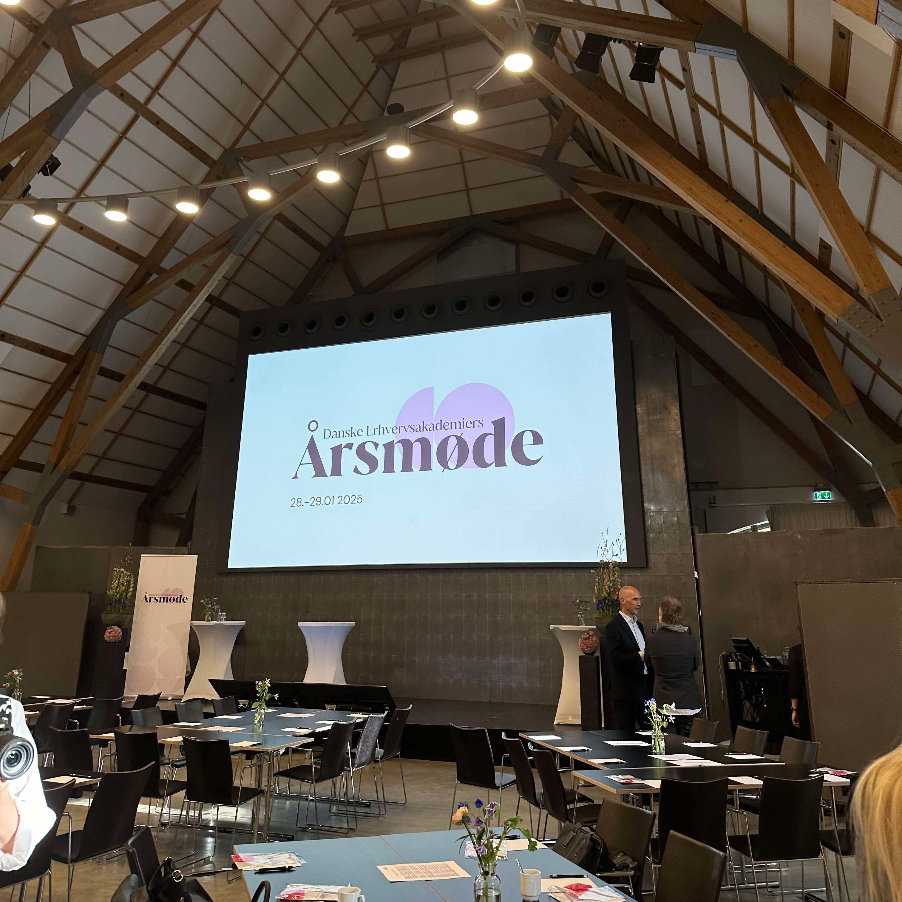
Challenge: Danske Erhvervsakademier needed a new visual identity for their annual Årsmøde, a national conference for Denmark’s business academies. The goal was to modernize the event’s look and feel while maintaining professionalism and institutional credibility.
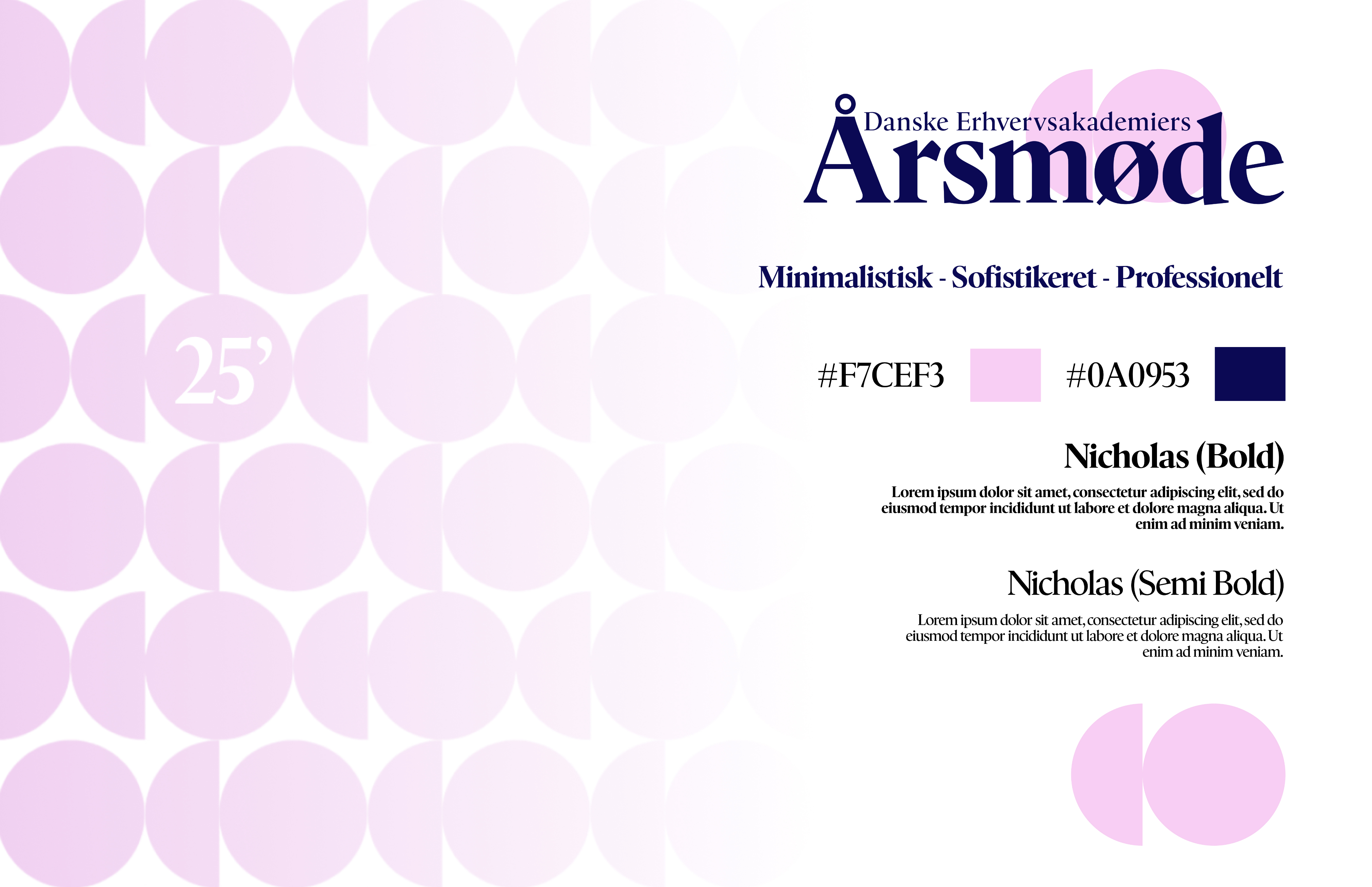
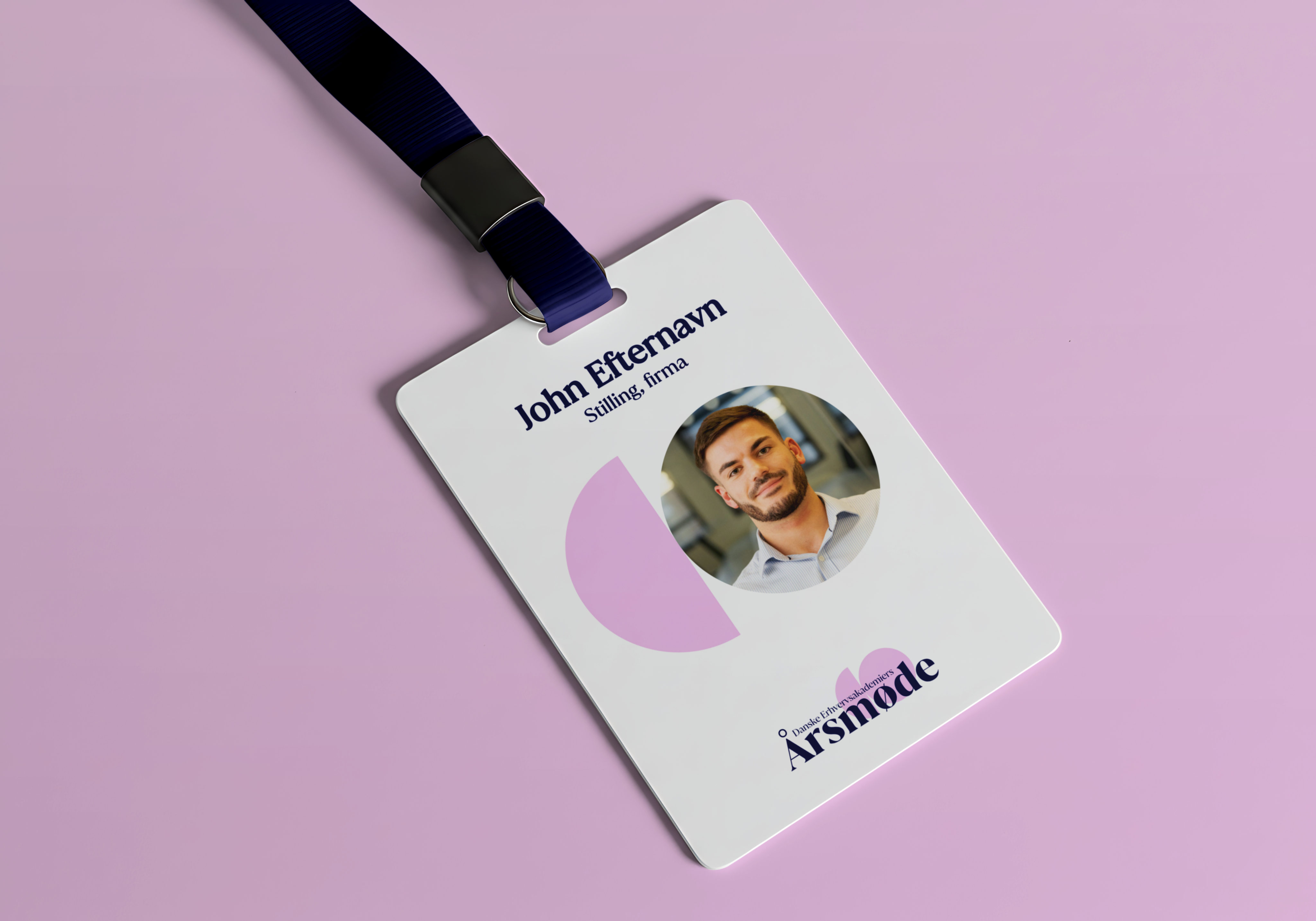
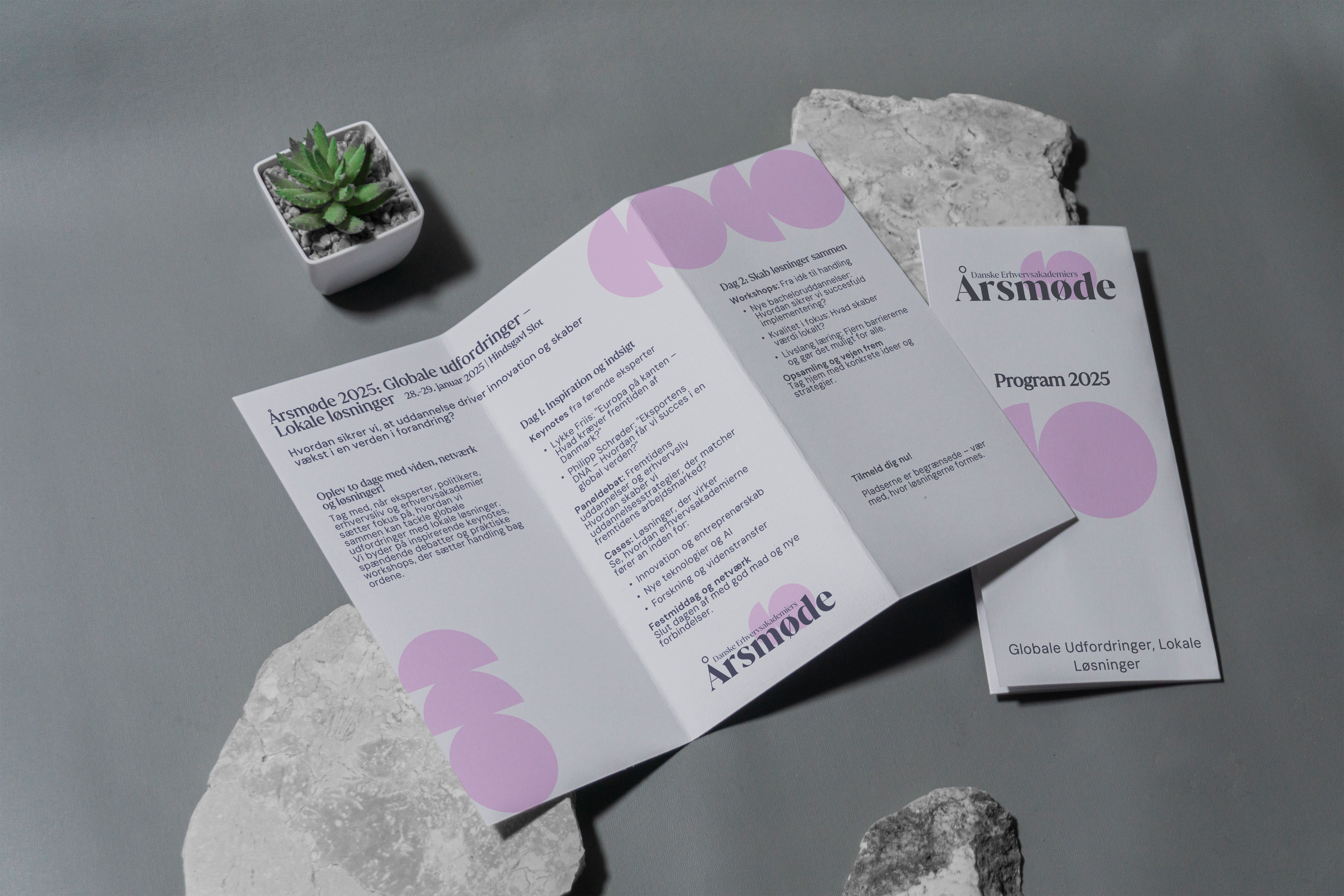
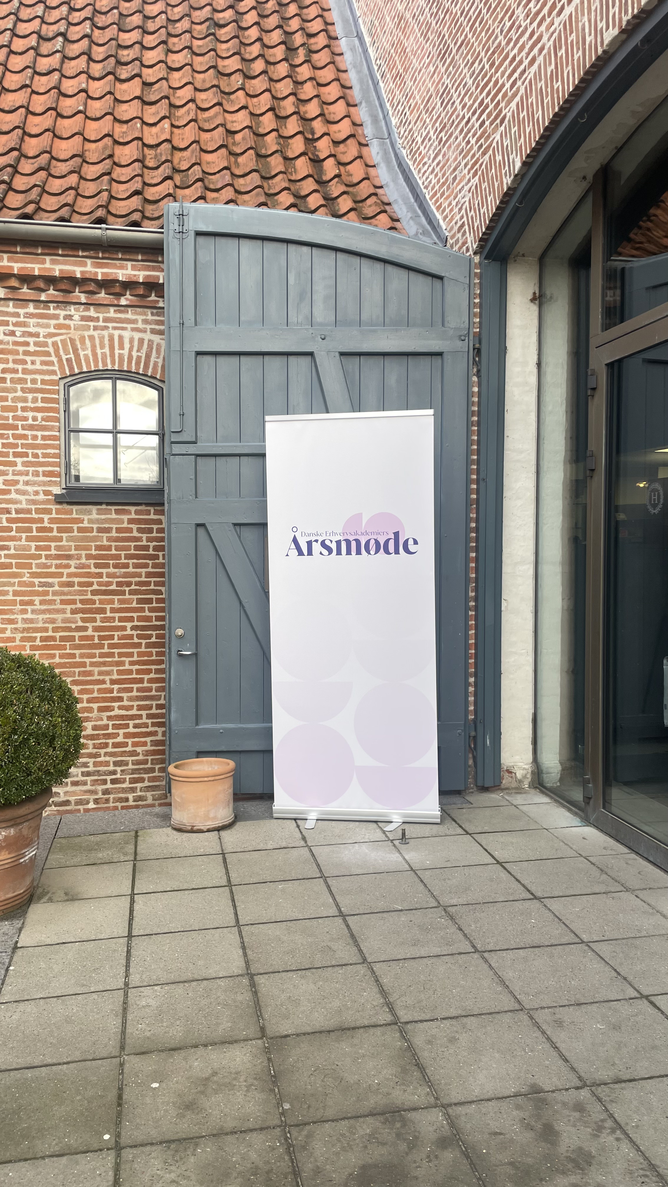
Solution: Together with the client, we defined four guiding values: quality-conscious, classic, lively, timeless. These became the foundation for the identity system. Typography, color, and layout rules were developed to express both movement and maturity. The process was collaborative and iterative, resulting in a flexible brand toolkit: a 30-page design guide and templates for PowerPoint, programs, name tags, roll-ups, and LinkedIn. The system was designed to be reusable, ensuring consistency across years and platforms without relying on trends.
Result: The final identity communicates trust, professionalism, and quiet confidence. It does not compete with the program itself, but allows debates, keynotes, and networking to take center stage.