
Augusta Q. Taylor


<OFFSPRING_CPH
Smykker
Håndlavede, rå smykker i sølv – designet i KøbenhavnUnisex ringe med indgravering & personlighedGaver med mening – til ham, hende & dig selv✨ Design dit eget → [link i bio]
New!
Custom
Q&A
Stories
100
Posts
100
Followers
100
Following


Offspring:
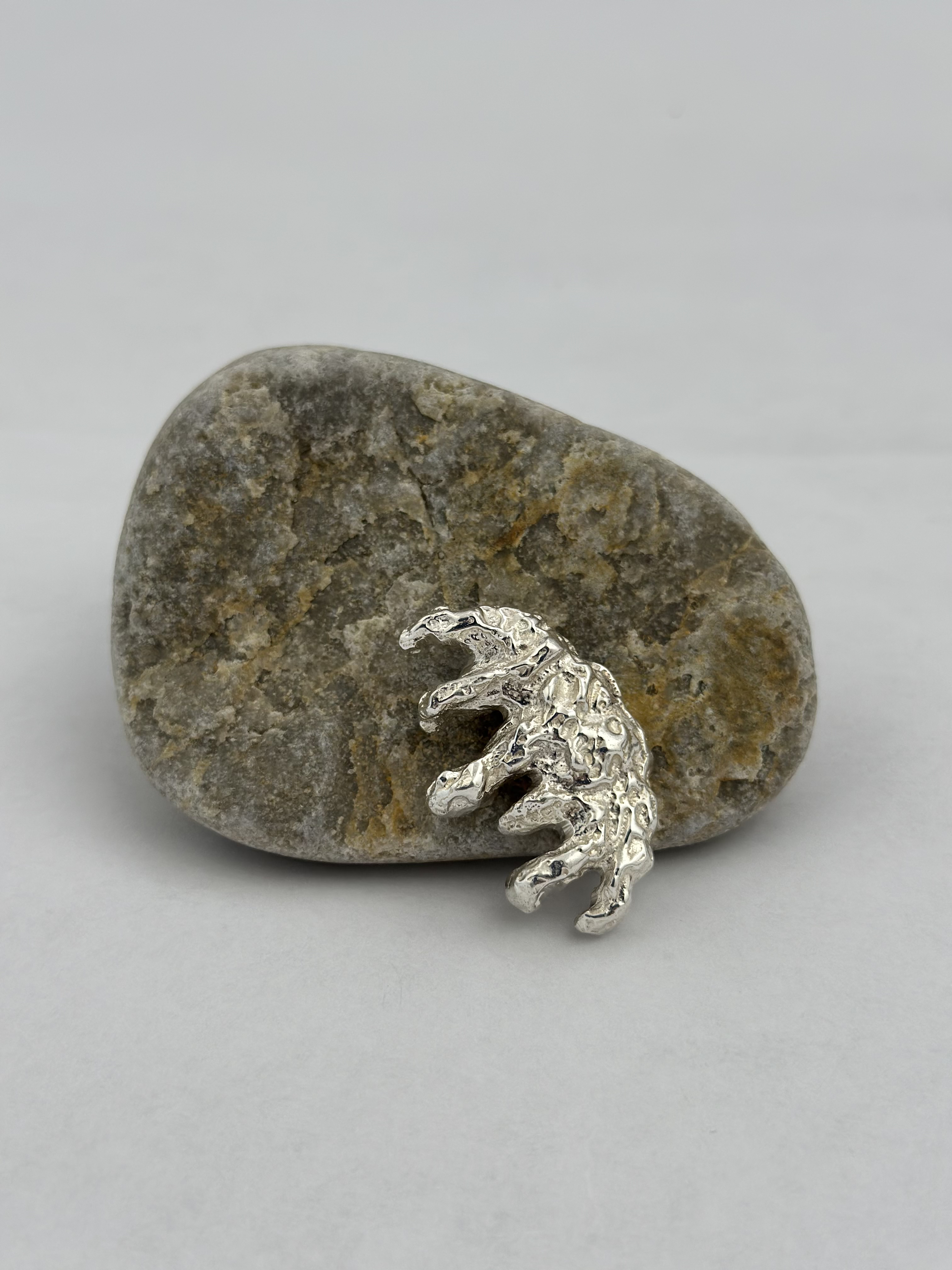
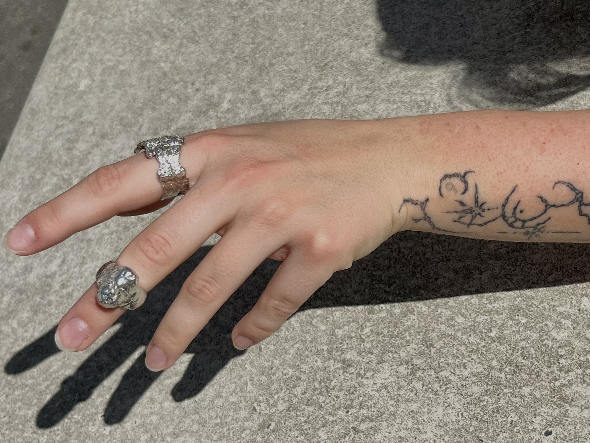
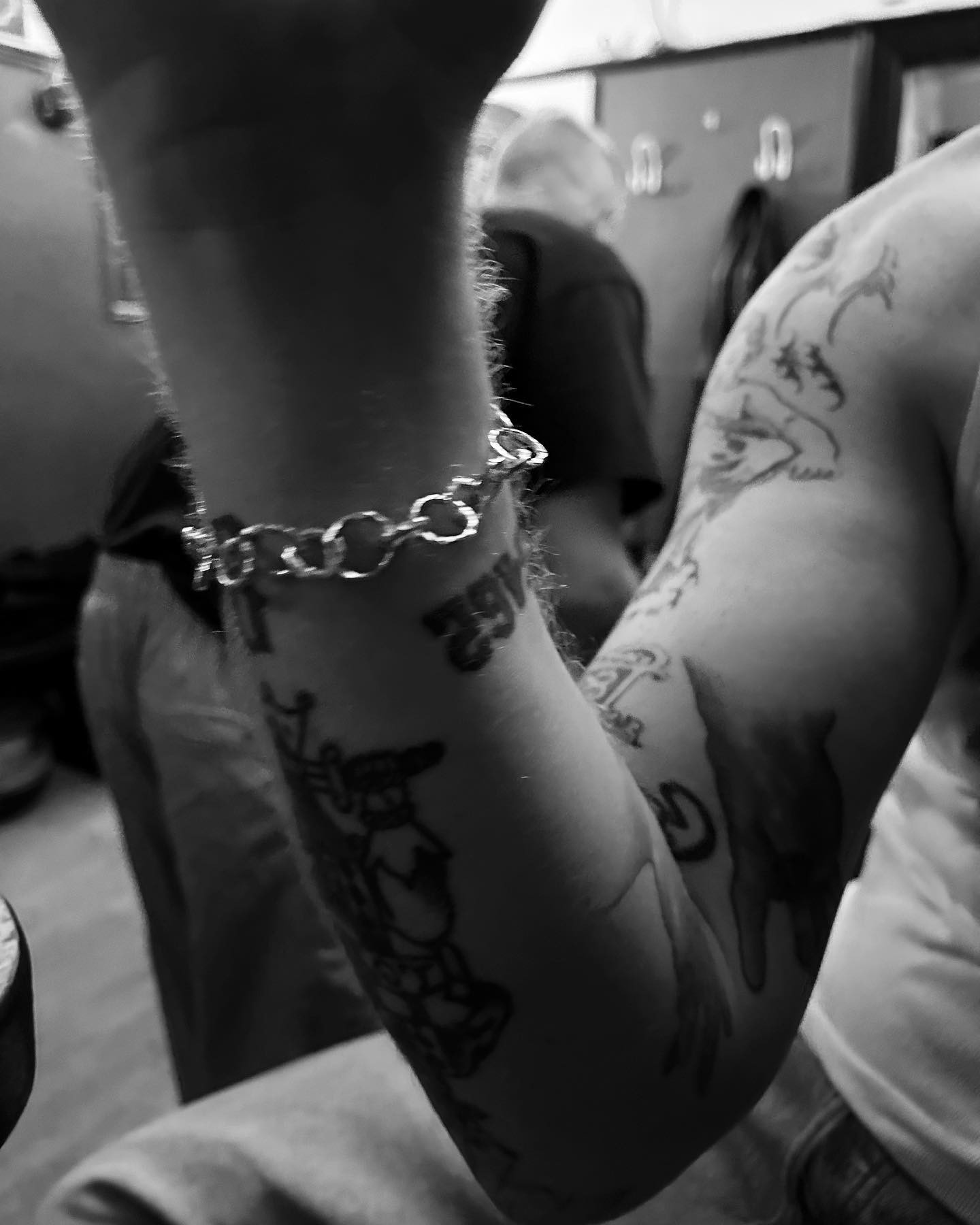
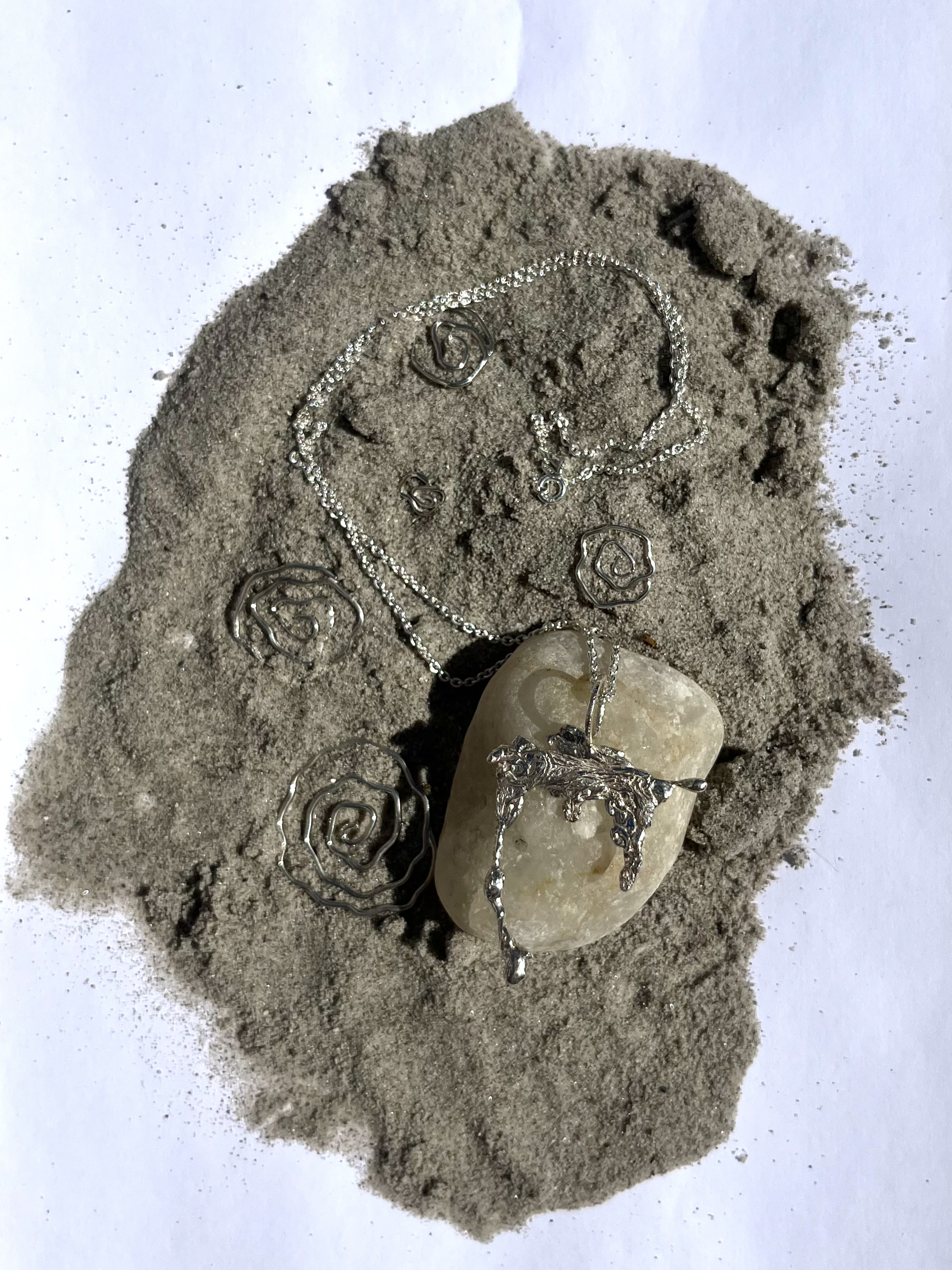
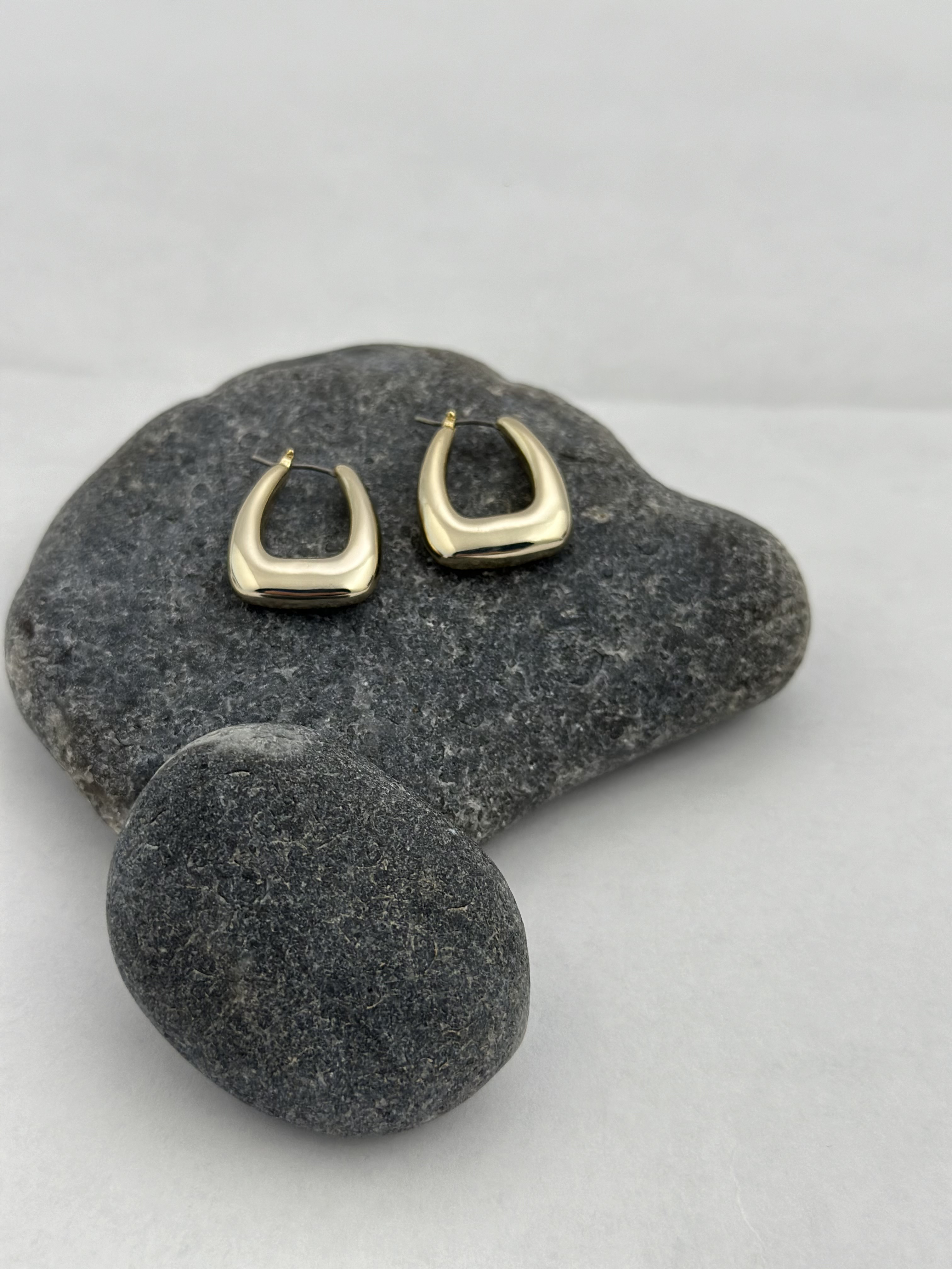
Challenge: Offspring is a small handmade jewelry brand from Kolding, Denmark. Rooted in heritage and personality, it lacked a clear visual identity and digital presence. All sales happened through Instagram DMs, making the process inconsistent and untrustworthy. The task was to create a brand and online experience that felt authentic while preserving Offspring’s raw, personal essence.
Solution: Through interviews and customer journey mapping, we uncovered friction points: unclear pricing, inconsistent visuals, and hesitation among buyers - especially men, who felt unsure about engaging. From these insights, we defined three guiding principles: clarity in the buying process, visual cohesion, and emotional resonance.
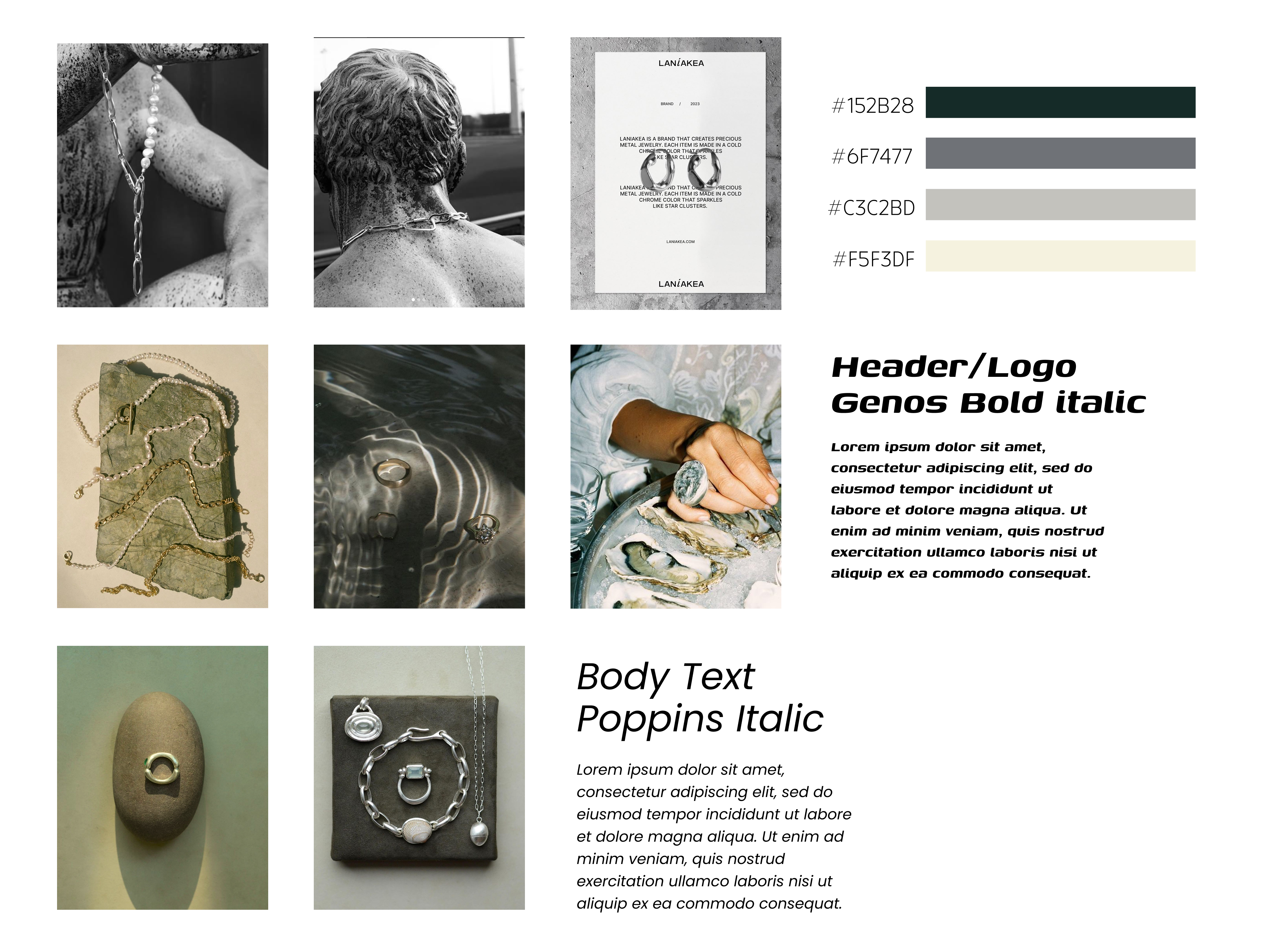
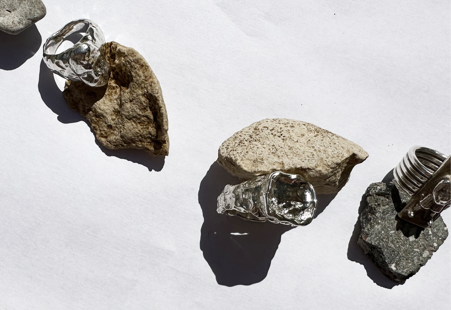
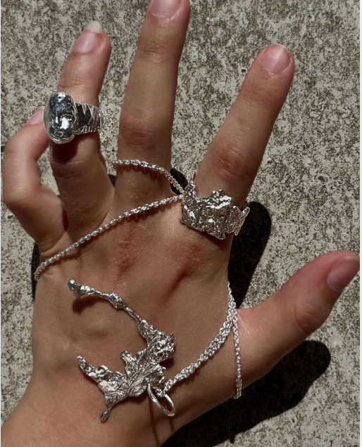
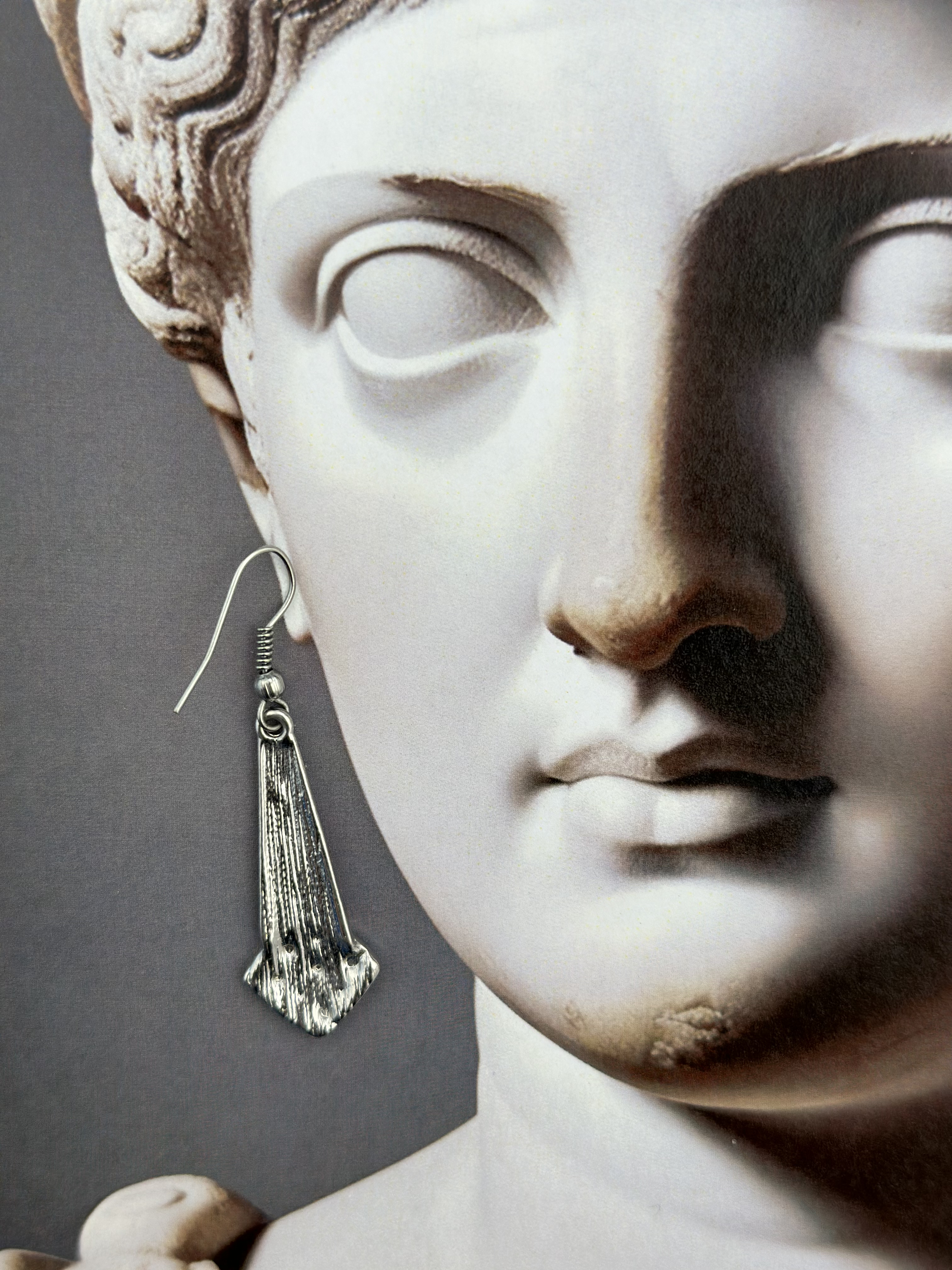
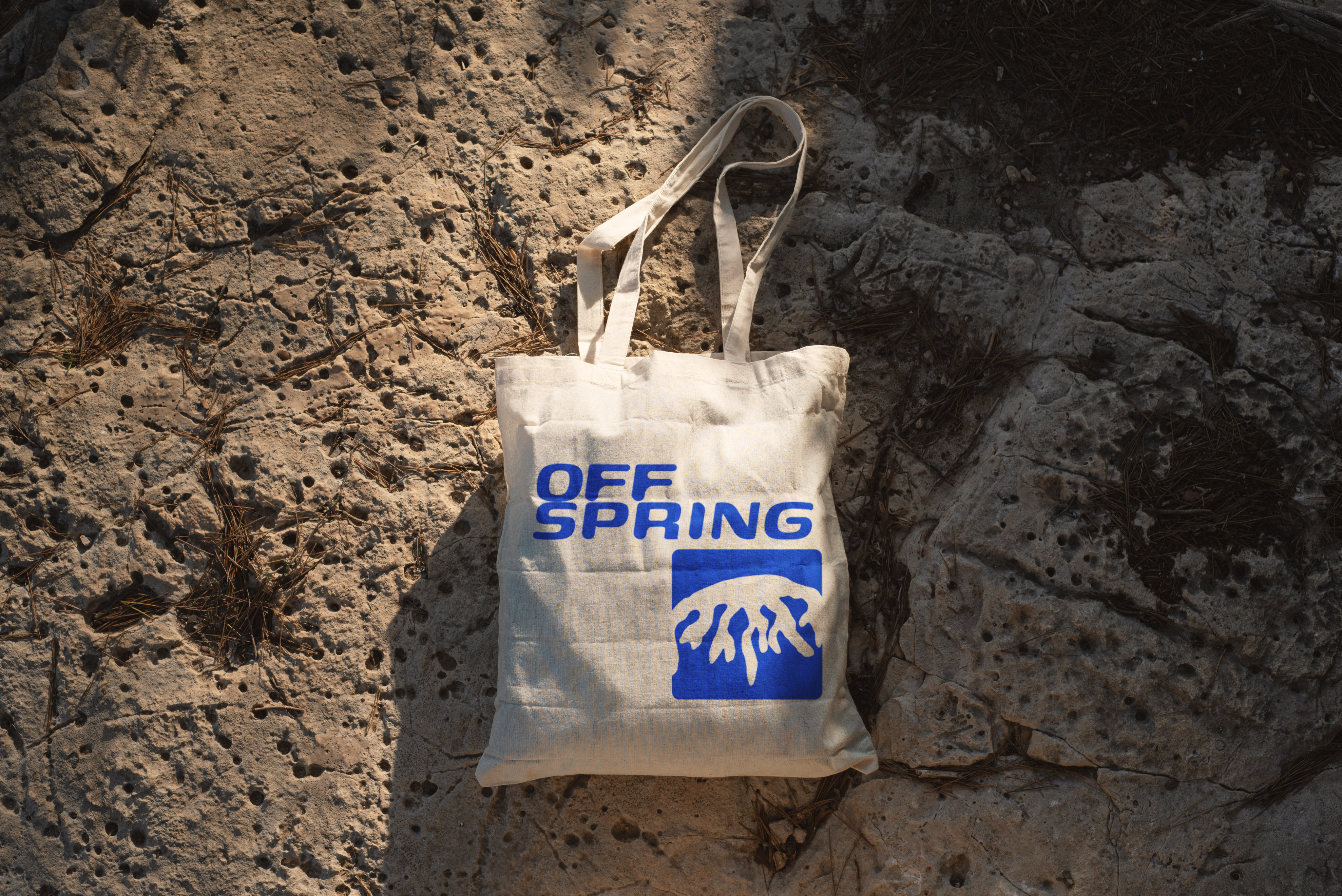
We built a refined brand identity including logo, typography, and color palette, tested with real users. The logo was carefully adjusted rather than redesigned, honoring its personal meaning while improving functionality. A portfolio-style website was developed in Figma Sites, highlighting the maker’s story and introducing a six-step custom form to simplify orders. In parallel, we redesigned Instagram visuals, creating a sustainable system the client could maintain with her iPhone and Canva. The focus was not perfection, but personality - raw, handmade, and consistent.
Result: The project showed that design begins with understanding, not aesthetics. By applying first principles thinking, we built a thoughtful, human brand experience that reflects the jewelry itself: intentional, personal, and meaningful.
<OFFSPRING_CPH
Smykker
Håndlavede, rå smykker i sølv – designet i KøbenhavnUnisex ringe med indgravering & personlighedGaver med mening – til ham, hende & dig selv✨ Design dit eget → [link i bio]
New!
Custom
Q&A
Stories
100
Posts
100
Followers
100
Following

Offspring:
Challenge: Offspring is a small handmade jewelry brand from Kolding, Denmark. Rooted in heritage and personality, it lacked a clear visual identity and digital presence. All sales happened through Instagram DMs, making the process inconsistent and untrustworthy. The task was to create a brand and online experience that felt authentic while preserving Offspring’s raw, personal essence.
Solution: Through interviews and customer journey mapping, we uncovered friction points: unclear pricing, inconsistent visuals, and hesitation among buyers - especially men, who felt unsure about engaging. From these insights, we defined three guiding principles: clarity in the buying process, visual cohesion, and emotional resonance.
We built a refined brand identity including logo, typography, and color palette, tested with real users. The logo was carefully adjusted rather than redesigned, honoring its personal meaning while improving functionality. A portfolio-style website was developed in Figma Sites, highlighting the maker’s story and introducing a six-step custom form to simplify orders. In parallel, we redesigned Instagram visuals, creating a sustainable system the client could maintain with her iPhone and Canva. The focus was not perfection, but personality - raw, handmade, and consistent.
Result: The project showed that design begins with understanding, not aesthetics. By applying first principles thinking, we built a thoughtful, human brand experience that reflects the jewelry itself: intentional, personal, and meaningful.
<OFFSPRING_CPH
Smykker
Håndlavede, rå smykker i sølv – designet i KøbenhavnUnisex ringe med indgravering & personlighedGaver med mening – til ham, hende & dig selv✨ Design dit eget → [link i bio]
New!
Custom
Q&A
Stories
100
Posts
100
Followers
100
Following
Offspring:
Challenge: Offspring is a small handmade jewelry brand from Kolding, Denmark. Rooted in heritage and personality, it lacked a clear visual identity and digital presence. All sales happened through Instagram DMs, making the process inconsistent and untrustworthy. The task was to create a brand and online experience that felt authentic while preserving Offspring’s raw, personal essence.
Solution: Through interviews and customer journey mapping, we uncovered friction points: unclear pricing, inconsistent visuals, and hesitation among buyers - especially men, who felt unsure about engaging. From these insights, we defined three guiding principles: clarity in the buying process, visual cohesion, and emotional resonance.
We built a refined brand identity including logo, typography, and color palette, tested with real users. The logo was carefully adjusted rather than redesigned, honoring its personal meaning while improving functionality. A portfolio-style website was developed in Figma Sites, highlighting the maker’s story and introducing a six-step custom form to simplify orders. In parallel, we redesigned Instagram visuals, creating a sustainable system the client could maintain with her iPhone and Canva. The focus was not perfection, but personality - raw, handmade, and consistent.
Result: The project showed that design begins with understanding, not aesthetics. By applying first principles thinking, we built a thoughtful, human brand experience that reflects the jewelry itself: intentional, personal, and meaningful.